Setup Storybook for your React projects
Are you even a frontend engineer if you don’t develop/test your components in isolation?


Testing components in Storybook. For more @see [BinaryDreams](bndr.rkph.me)
In modern frontend development, testing components in isolation is crucial for ensuring code quality and efficiency. Storybook is a powerful tool that facilitates this practice, allowing developers to develop and showcase UI components independently.
So lemme hold your hand and guide you with every step to set it up for your Next.js (App dir router) project.
Step 1
We need to initialize it in our project. Go to the root directory and do:npx storybook@latest init
Good! If you’re utilizing ESLint in your project, you’ll receive a prompt asking if you’d like to install the necessary dependencies that align with Storybook. Simply respond with “y” and proceed.
Excellent! Upon inspection of your project, you’ll notice that Storybook has generated a .storybook folder and a stories folder.
The .storybook directory houses configuration files, while the stories folder contains example Stories.
Chances are, installing Storybook in your project also started the Storybook development server at localhost:6006, if not, try npm run storybook in your project using the terminal.
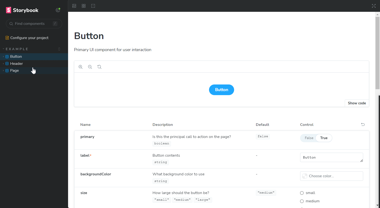
What do we see?
We see a beautiful✨ dashboard with all the Stories defined in your project! (these are examples stories that come with the installation)
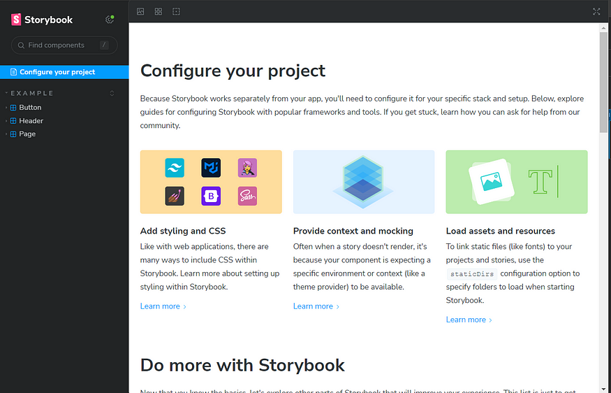
You have Button, Header and Page stories listed on the left pane.
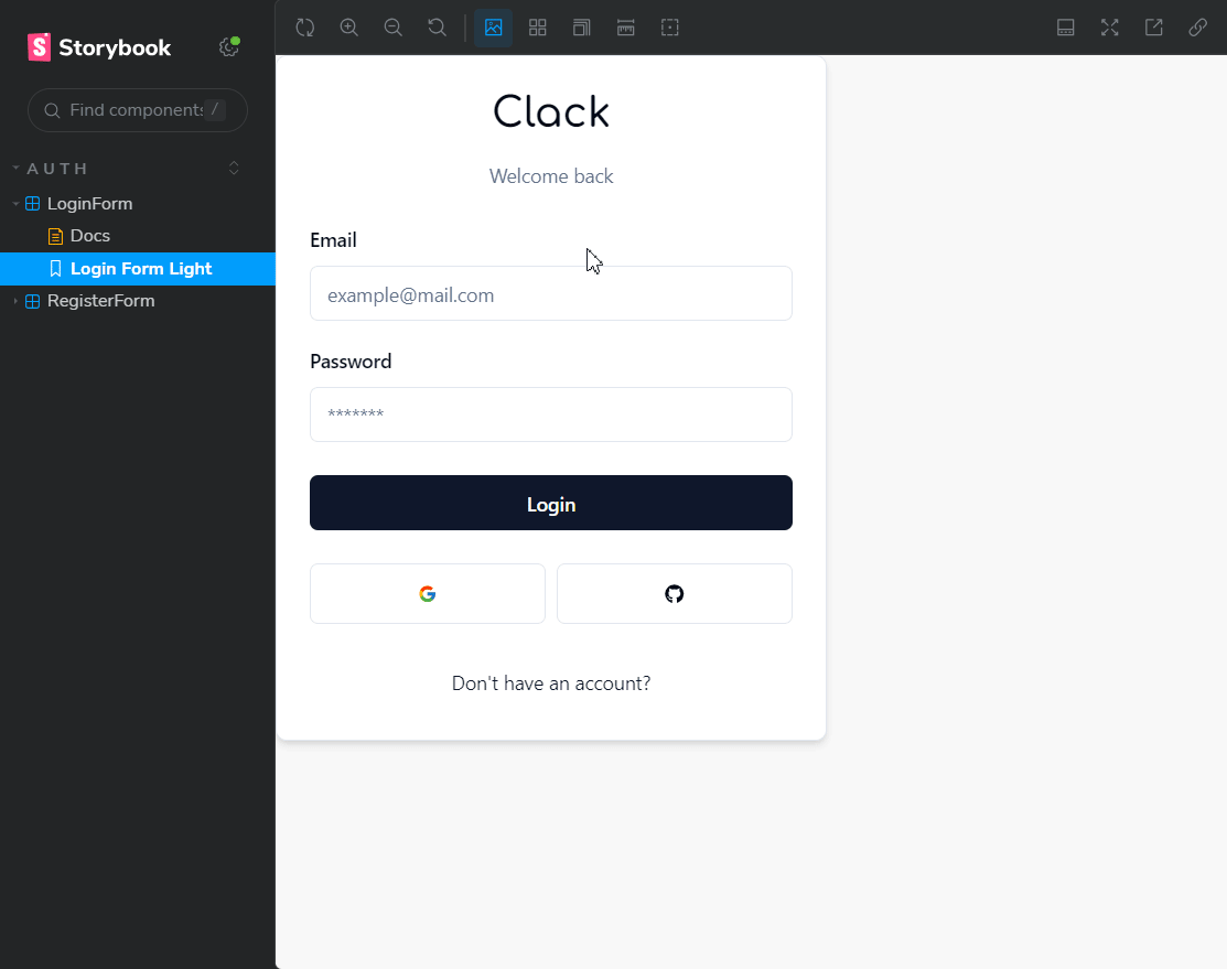
Click on a Story and you get a good overview of the component along with it’s description, the props it takes, etc.
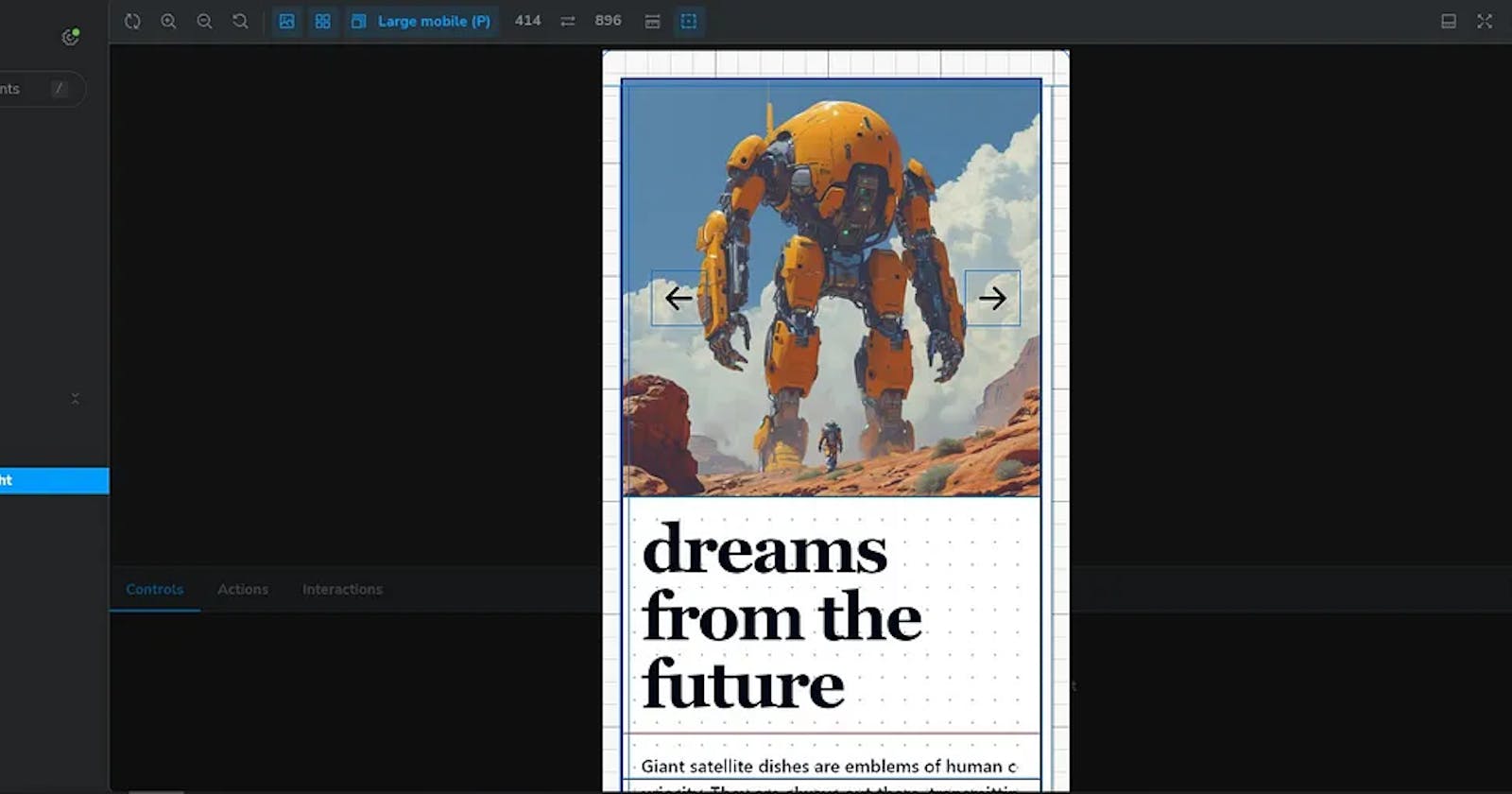
The Header Story
Congrats! You’ve just setup Storybook for your project. BUT you need to jazz it up by properly plugging in TailwindCSS. (cuz who doesn’t TailwindCSS?)
Setup Tailwind!
Unless you’ve been living in a cave (or under a rock, if you prefer), you probably know how crucial TailwindCSS is in the modern web dev scene. But the TailwindCSS utility classes won’t work with Storybook out of the box.
So here’s what you have to do
open the file preview.ts in the
.storybookfolderimport your main CSS file, or in my case
globals.css

Import globals.css
You’re doing great!
Stories
Stories are a declarative syntax for supplying props and mock data to simulate component variations. Each component can have multiple stories. Each story allows you to demonstrate a specific variation of that component to verify appearance and behavior.
You write stories for granular UI component variation and then use those stories in development, testing, and documentation.
This is very simple, don’t worry if you can’t get a hold of it in the beginning. We write a story by importing a component we made in to a file ending with .stories
If you are making a Story for LoginForm.tsx, make a file called LoginForm.stories.tsx.
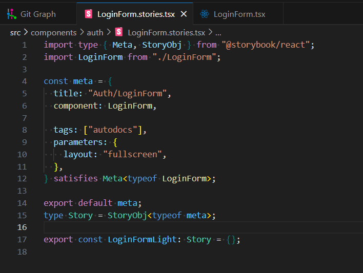
A Story.
We’ve imported some
typesfrom Storybook since we’re using Typescript in this project.We then import the component that we want test/develop in isolation and define write meta data for the component.
Add the name of our component with the category under which it should be grouped. Here, the title is “Auth/LoginForm”. ‘Auth’ is the category. Think of it as a directory structure.
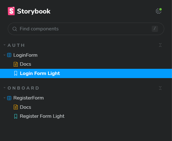
We have currently defined to categories. Auth and Onboard
Don’t worry about this part. You can just copy this meta object in every component. But do change the name and define the imported component for which you’re setting the Story for!
These lines imports types
MetaandStoryObjfrom the@storybook/reactpackage.
satisfies Meta<typeof LoginForm>;

export default meta;
type Story = StoryObj<typeof meta>;
- These types are used to define the structure of stories and their metadata within Storybook.
import type { Meta, StoryObj } from "@storybook/react";
import LoginForm from "./LoginForm";

const meta = {
  title: "Auth/LoginForm", // category/unique_name
  component: LoginForm, // the imported component

  tags: ["autodocs"],
  parameters: {
    layout: "fullscreen",
  },
} satisfies Meta<typeof LoginForm>;

export default meta;
type Story = StoryObj<typeof meta>;

export const LoginFormLight: Story = {};
We define stories according to the Component Story Format (CSF), an ES6 module-based standard that is easy to write and portable between tools.
The key ingredients are the default export that describes the component, and named exports that describe the stories.
Voila! You now know how to use StoryBook!
Do note that I’ve not touched upon powerful features like decorators, adding contexts to stories etc. That’s for another day.
Keep building, keep learning. After all, there’s nothing that teaches like a project!
Footnotes:
Checkout my repo to see how I’ve used Storybook : https://github.com/phukon/binary-dreams?tab=readme-ov-file#binary-dreams
Socials: https://rkph.me/links